For the past two summers, I’ve worked at the oldest horsetrack in the country, Saratoga Racetrack. I work as a mutuel teller and my job has me selling and cashing bets. It’s an okay job, the pay is not high, but it’s quite flexible and it’s totally different from teaching and so the break is nice. Plus all kids of interesting characters are present:

A bonus to working the betting windows is that you can get tipped if you are considered “lucky”. I am not a bubbly female, and since most of the tips come from males, I don’t bring in as much as others around me (sorry to the fairer sex, but ladies don’t tip anywhere near as much).
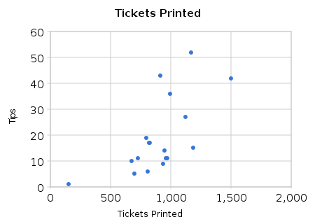
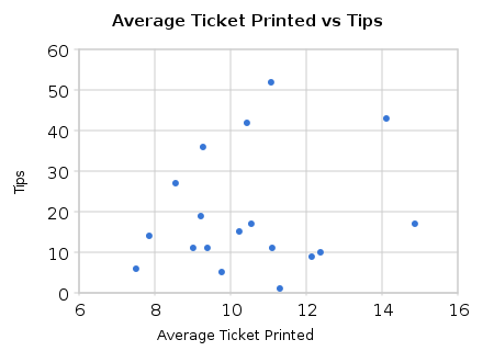
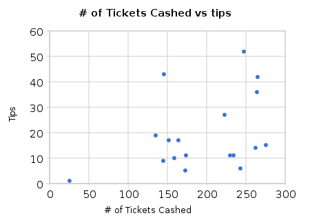
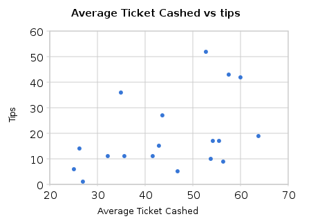
As a geek, I have been looking for a pattern for when I get better tips. Some days are full of newbie bettors who show up for the free t-shirt giveaways and make “$2 show” bets all day long. Others are filled with relative high rollers who routinely bet upwards of $100 a race and can cash in for more than $1000 if they hit. I was curious if tips were correlated to one of the following stats:
- Number of bets printed
- Average bet printed
- Number of bets payed
- Average bet payed
So I kept track of the information all summer with the summary slips that I printed at the end of each day. Sidenote: google spreadsheet worked pretty well for this task because I could update the info from my phone. But the charts were not as customizable or as nice to use as excel.
The full dataset is here.
Simple scatter-plots follow:
What does it all mean?
I don’t know. Originally at the beginning of the summer I would have bet that the correlation between average ticket cashed and tips would have been the strongest because when you cash out a large winner you often get a tip. So more large winners brings the tips up and brings the average ticket cashed up. But can I buy prednisone online in UK visually it looks like the strongest evidence lies with the number of tickets printed. Busier days yield better tips makes sense, but I would have guessed that the other variables would be, um, more refined. I’m no stats geek (statistics is the red-headed stepchild of math IMNSHO), but it looks like these data have a good amount of variation.
This self-run project encouraged me to keep statistics about other parts of my life, and I ended up ripping off Dan Meyer’s Feltron Project. My Applied Math class will be recording their information for their Feltron project for the next month and you will certainly hear more from this in the future. Good news: most of the kids seemed into the project. We’ll see how they are in a week or two, but they were engaged.


